PICS Redesign Case Study
The challenge of doing a redesign is deceptively complex; users tend to look for the familiar in both form and function, and aren’t typically comfortable changing processes they currently use.
In the case of the PICS platform at Bank Of America, users had been given a method of researching a company’s MNPI (Material Non-Public Information) and creating deals from this information. There were controls scattered throughout providing varying degrees of access, but the navigation was unusable, the methods were circuitous and, after talking to end-users, it didn’t give them the level of control they needed.
The business leads were not looking to reinvent the software, as it was functional (not to mention that a complete overhaul would be both time- and cost-prohibitive); the main concern was its usability. My main focus, therefore, was to align with the end users, identify their pain points, read the JIRAs (for the enhancements and bug list) and come up with a plan to modernize the interface while maintaining cohesion with the brand identity I had established in a prior project.
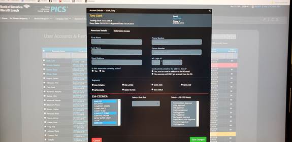
>Once I had the buy in from the end users, developers and senior management for the design, I was tasked with building all screens and interactivity using Bootstrap to hand off to developers for the build. This included all modal windows, tab panes, custom views and interactions (built using jQuery) for use with Internet Explorer 11 and the latest version of Chrome.
Simple.
The first step in any project is to talk to the users. In order to get buy in from the end user, it’s important to listen to their frustration and their ideas; to know what they do, why they do it and whom they do it for as well as understand the competing priorities within the process.
The biggest complaint they all had was that every time they wanted to do something or needed a piece of information, it involved finding the link in the overly-complex, hard-to-read navigation menu and the software would open the link in a new window. It wasn’t uncommon to have fifteen to twenty windows open at the end of a session.

It seemed pretty obvious that the site navigation had to be larger, simplified and the main job functions had to be centralized to provide users with as much related information as possible.
Users also complained that the home page that was in place was useless. Once they logged in, the system didn’t tell them what to do. The existing page had a graph that tried to catalog some of their recent activity and little else.
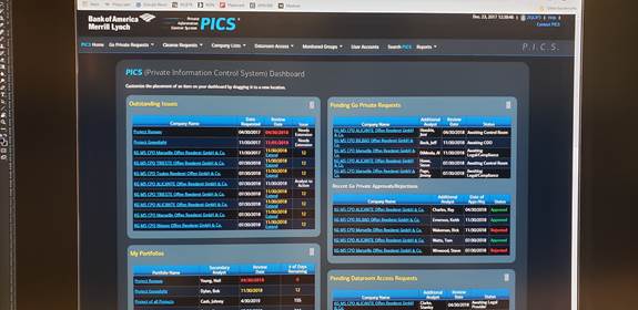
To remedy this, I designed and coded an interactive home screen that showed all recent activity grouped by action type that allowed users to customize their view by drag-and-dropping the modules into the order of their choosing.

To further aid users in understanding their priorities, I color coded column data to indicate important due/past due and approaching dates so they could see at a glance what should be worked on during a given session. This approach was used throughout the application where needed to ensure a consistent user experience.
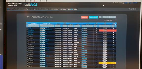
Another important consideration of the project was to ensure that the relevant information was shown on the screen whether the user was a super user, financial analyst or a trader because each type had restrictions on the information they were permitted to see. The design pattern used for the interface had to be scalable and the artifacts created had to be ‘recyclable’ for use with this and future projects.

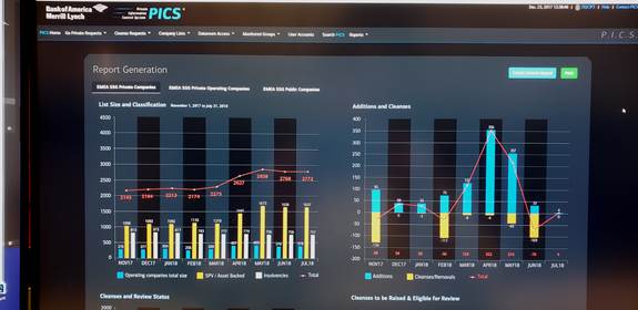
Lastly, senior management needed a way to review the activity of their staff. This was something that they were pulling from downloads into Excel and posting to PowerPoint for review. They needed a way to dynamically review statistics on demand for a given date range and be able to print these reports in landscape. So, using their existing report structure I designed a structure around these reports that is easier to read, configurable and fit within the brand standards. I worked with developers to ensure that the print quality and layout would meet the expectations of senior management.

The final live demo I did for the end users and senior management, the majority of which were based in England and India, was lauded for its design and efficiency and, afterward, it was immediately slated for development after the lead developer reviewed the code I had developed.