Bank Of America / LFS
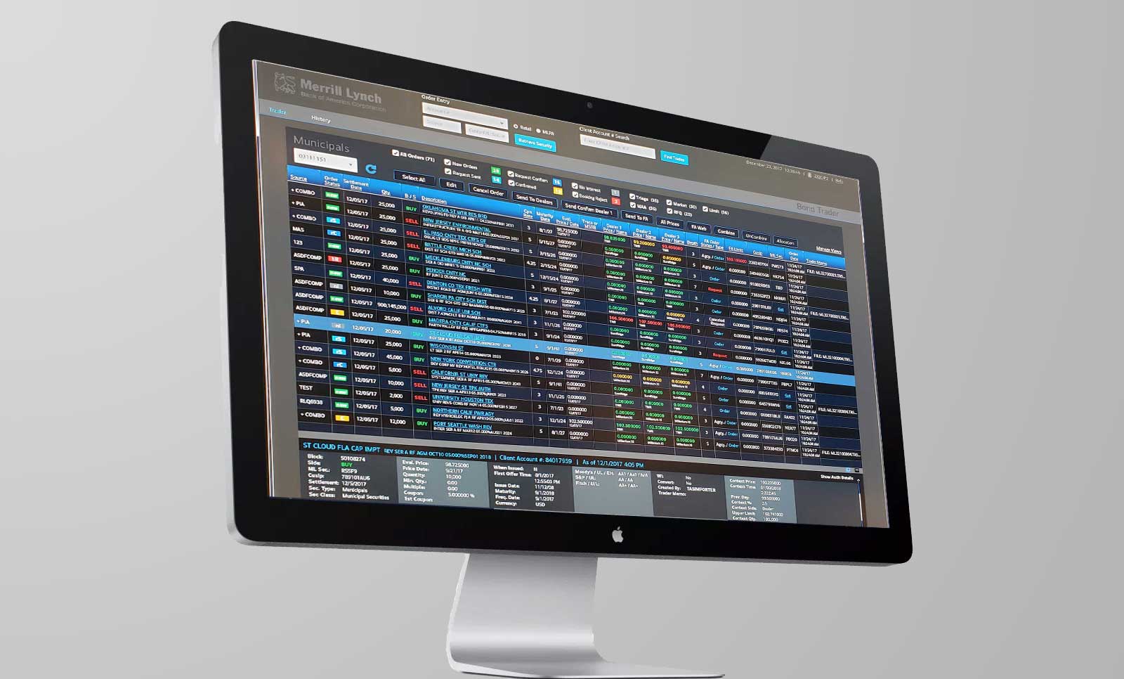
Trading application for the Bond Desk. Read the Case Study!
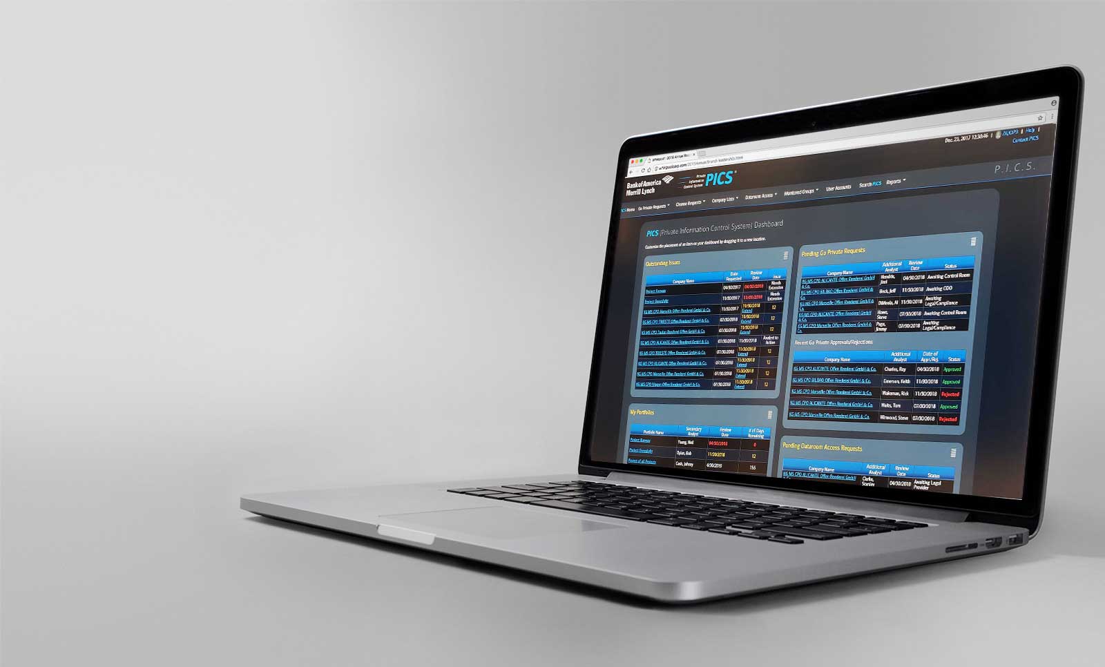
Bank Of America / PICS
Application for the information managers. Read the Case Study!
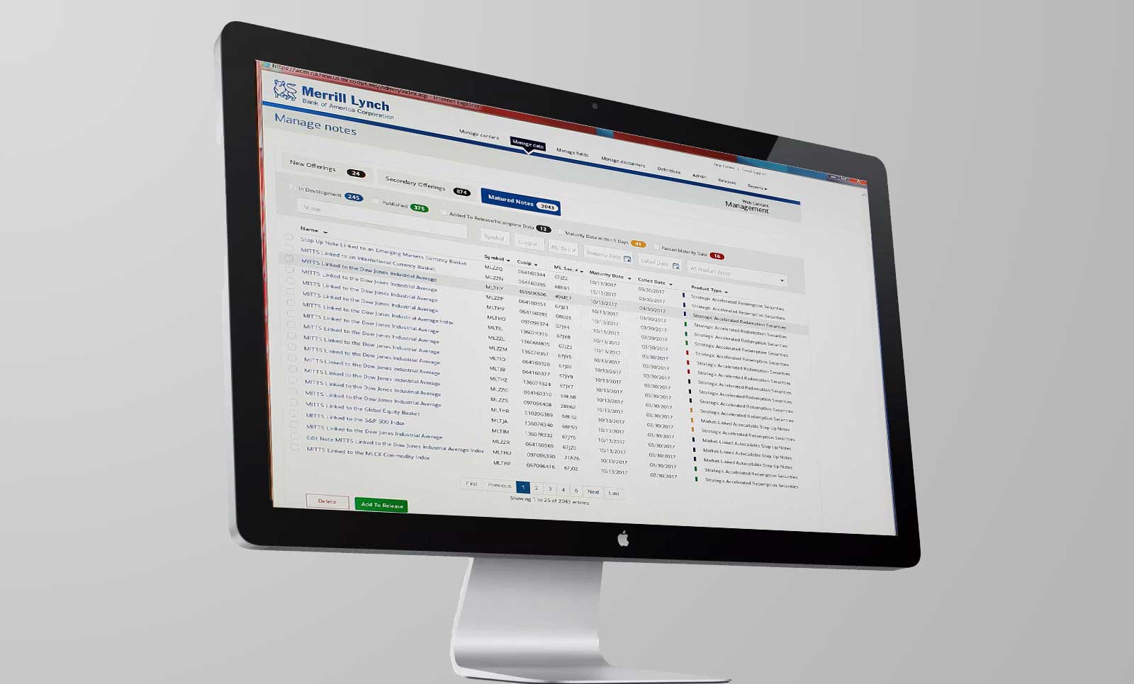
Bank Of America / WCM Tool
Application used to push information from back-end databases to their client-facing website.
Bank of America 10/2017 - 2/2019
My contract for Bank of America was both successful and productive. As a lone contributor, I was responsible for user research, mockups, prototyping, getting buy-in, front-end development and working with developers to get the final deliverable into QA for testing.
The majority of work needed was in redesigning years of development work that had neither interactivity not branding. Users found the navigation to be difficuly to use, the main data table was overly complex and it was visually unappealing.
Since the redesign would encompass the entirety of their back end, I had to introduce a color scheme that brought a sense of unity to the disparate software applications they were using. My approach was to use a Bootstrap-based grid and jQuery to make use of widgets and baked-in tools that I knew would be necessary while creating reusable code structures and design patterns to enhance the speed and consistency of future development.

As with all financial institutions, there was a tremendous amount of data that had to be displayed on the screen. The important thing was to find out user priorities from screen to screen. Having working software, in this case, was both an advantage and a disadvantage. Users knew how to work with what they had and found it difficult to accept the idea of learning something new; but by keeping some of the old foundation in tact, I was able to get immediate buy-in to my designs.

There were a number of usability challenges, but my main focus was to ensure that end users had all the information they needed visible on the screen to make a trade. I had to eliminate left-to-right scrolling and create visual cues so that trades that needed their immediate attention were easily located and trades that were nearing that status were flagged as well.
From an architecture point-of-view, organizing the information with so that it maintained the traders' workflow was the most important task. Column heaaders and sections were given subtle background differences to give the page a logical structure that was easy to understand and follow.
