LFS Redesign Case Study
The LFS system is used by the Bond Desk to evaluate and facilitate trades and was built by developers in the mid-2000s. The application is critical to the business and represents tens of million of dollars, so modernizing its design and consolidating the massive amount of data needed to make trades was extremely important to senior management.
For this project, I was given no direction other than the interface should be similar to a product designed by another team, which featured a dark skin. As designed, the system was effective but had to be updated, more trade data needed to be visible on the screen and traders needed the ability to easily customize their view to match their trading preferences.
After speaking at length to the end users, they really didn’t give me much to go on; they’d been using the application for so long, the inconvenience of the left/right scroll went unnoticed. Locating their custom table setup from the global profile list was no big deal; and opening a function that completely covered the main table and its trade details was the norm. One detail I had to be cognizant of was that one of the FAs had a severe vision impairment with an inability to discern low contrast in type and imagery; he also complained that the 11pt type was hard to read.
When I set out to start prototyping, the first thing I had to establish was an effective color palette; this screen was going to be stared at all day, so I didn’t want to use colors that were too dark or too light. I decided on a pastel variation on the bank’s brand blue for the alternating row color and set that on a dark gray background; the type was to be off-white and the links, light blue. This worked well when using other colors for danger, warning and safe colors as well.
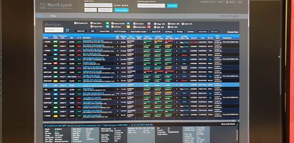
The biggest challenge in creating the interface was the massive amount of data needed to understand the value of a trade. Using a copy of live data, I set out prototyping in Photoshop with the goal of eliminating the left/right scroll by combining columns of data wherever possible by stacking data points (i.e.: Description 1 on top of Description 2, Dealer 1,2,3 Price on top of Dealer Name, etc.) and using all caps for the secondary data points to increase readability.
In this manner, I was able to concatenate thirty-two columns of data into twenty. I did have to sacrifice some height using two lines per row, but the end users agreed that losing six or so rows on a full screen browser for the dramatic improvement to the usability was a justifiable trade off. Not only that, by color-coding strategic data points, users were visually informed of securities that required their attention at a glance. They could even assign priority to securities by clicking an icon and choosing a priority color from a list.
With regard to custom user interfaces, the development team decided upon a jQuery bolt on called agGrid. This software would enable drag-and-drop columns that were filterable by keyword and established ranges. So, even though the interface would be losing rows because of the increase in height to each row, they’d be able to see more of the data that was important to them. Once users had customized their view, developers would store the change in the interface in a cookie linked to their ID for each security type (i.e.: Municipals, Corporate, etc.).
Once I started building my table in Bootstrap, I gave the row a hover color, which, onClick, would commit the color to the background and display the security details and audit trail to users. In this way, I was able to display over sixty data points on screen without having to leave the main table.
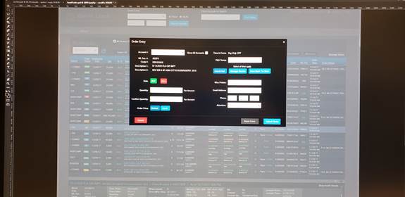
The functions (i.e.: Send To Dealers, Send To FA, All Prices, etc.) were easily rendered in a more streamlined way using Bootstrap’s modal windows. I kept the arrangement of the buttons the same as the prior version to keep the interface familiar, but also introduced order status filters to give users another level of control over what they were seeing.
The progress demos I did for senior management, the business owners and FAs were met with universal praise. Each iteration of the project led to enthusiastic discussion and an eagerness to get the project into development.
Once development began, the Agile environment led to the need for additional screen development which I was able to code quickly working with developers assigned to the different aspects of the project. There were a total of six to eight developers that rolled on and off the project and each one would reach out as often as necessary to get additional CSS or bits of jQuery to add additional interactivity.
The project is now in QA for testing with an expected production deployment of May 2019.